The Challenge
Stock accuracy was only ~70%, making it risky to promise reliable in-store pickup. Improving stock accuracy was out of scope.
👉 How do we design a Click & Collect experience that customers can trust — while working within our technical and operational limits?
Project Goals
For The Business
• Introduce Click & Collect to match competitors.
• Reduce cost per item by shifting some fulfilment from delivery to store pickup.
For Customers
• Provide a smooth and reliable Click & Collect experience.
• Reduce frustration caused by out-of-stock items at collection stores.
Design Approach
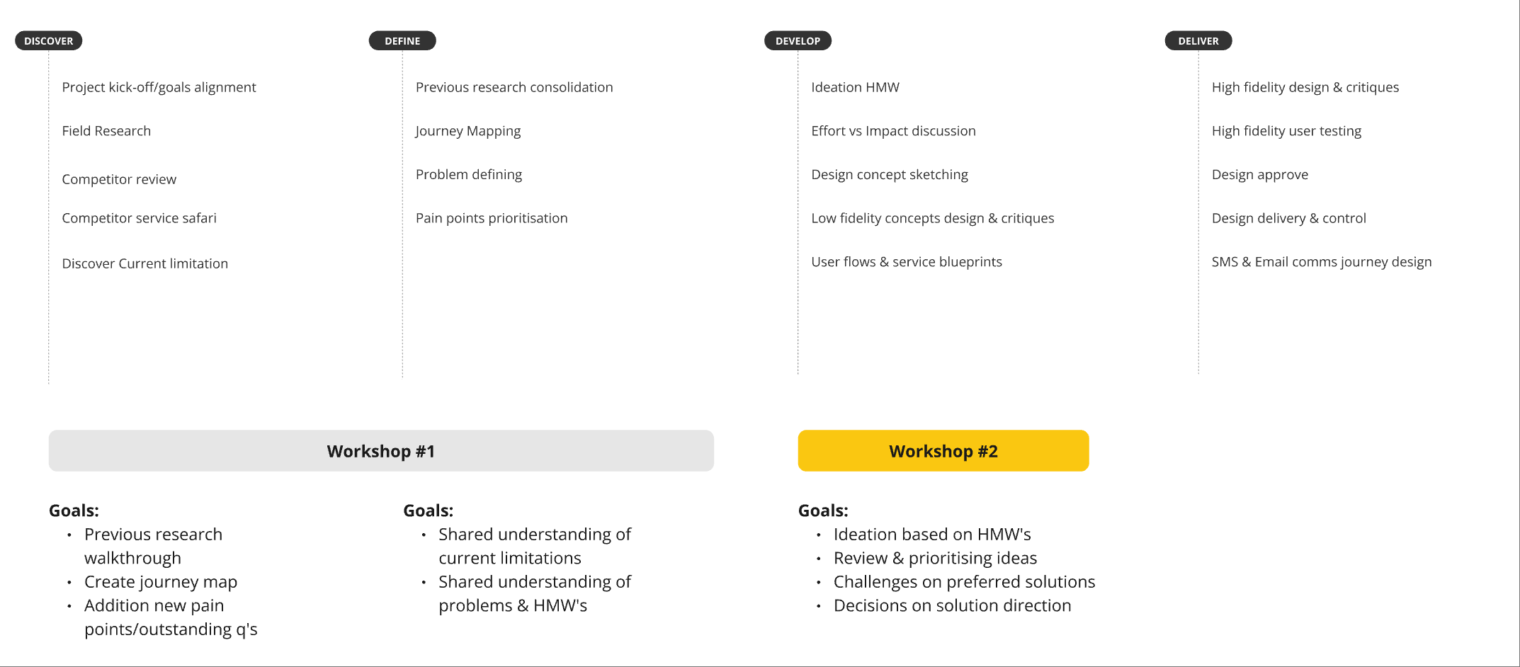
Research
Field Research
To understand the problem deeply, I left the office.
After conducting interviews and brief on-site inspections (as staff were busy with their customers), we got several discoveries:
1. user normally would ask the store staff hold the item for them (store staff can’t guarantee it as they need to consider walk-in customer as well).
2. staff juggling walk-ins, online orders, and phone calls with only 2–3 people on shift.
3. store staff can’t pick up all the calls during peak time.
Competitor Review & Service Safari
Since this is a new product for us, it’s good to see how our competitors doing with this functionality.
I analysed 5 competitors online, conducted in-store visits at 3.

Service Safari
From the discoveries in our competitor review, we can have a quick overview about what quick wins we can learn and what we can avoid.
Finding: inconsistent experiences between pre-purchase and post-purchase


Journey Map
What would be the click & collect looks like with our current setup? and what can we do better on our competitors?

During the session, we discover some key painpoints that we need to look into while we implement:
Critical
• The whole order blocked at checkout when only 1 item out of stock.
• Not enough pick up instruction & timeframe information.
• Nil pick (Fail to fulfil the order)
Medium
• Users had to repeatedly select their preferred store for each order, creating duplicated actions.
• Store staff could be too busy serving other customers, causing Click & Collect orders to be unavailable upon arrival.
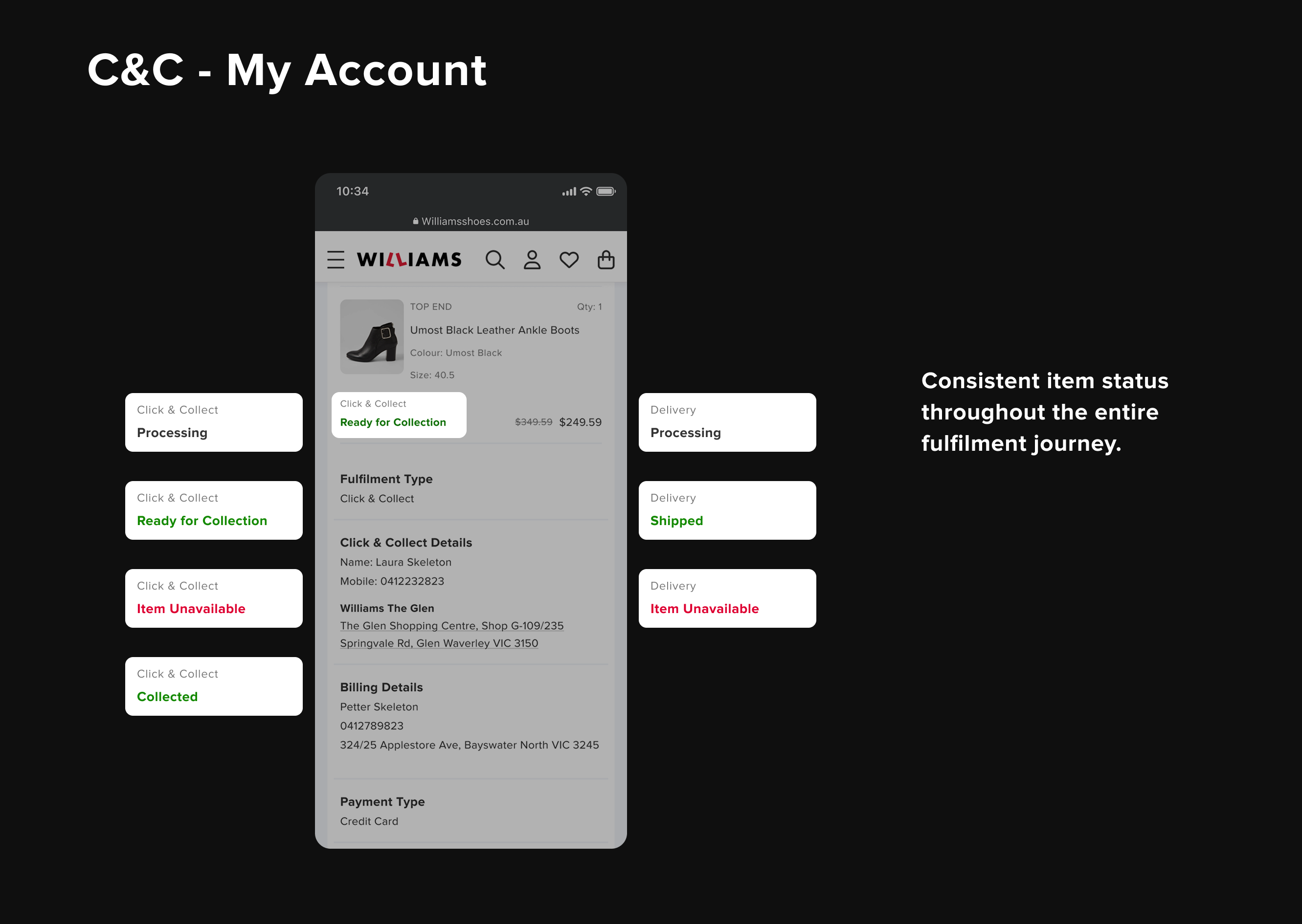
• Order status tracking was unclear throughout the order lifecycle, leaving customers uncertain.
Low
• Customers are unsure how to cancel Click & Collect order.
• Customers might not have time to collect their order
• Customer might want to add more item before collection.
Turning Insights into Solutions
Once we have the prioritised problems to look at for our MVP, we can start to come up some ideas about how we can potentially solve them and group them by similarities. we also need to extract the most popular solutions to see if it’s any major technical constraints.
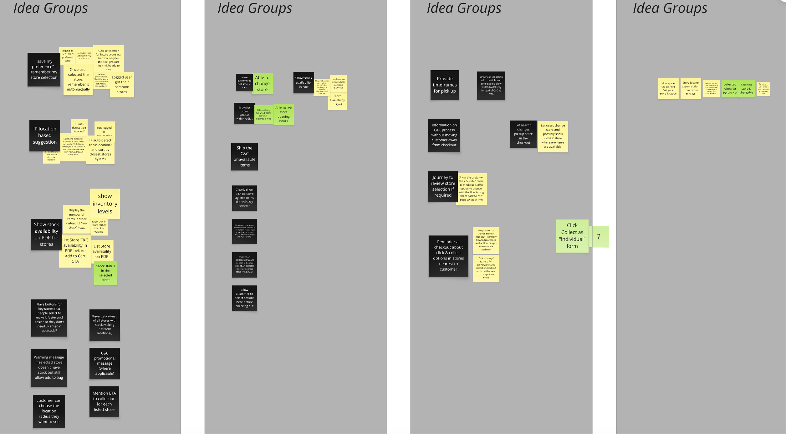
Ideation & Feasibility
After grouping our ideas, we need to have a technical session with the devs to see how hard to build these feature.
Turns out some ideas that we really like, such as picking up in different stores, ship to store etc are pretty hard to build in back end and we also not sure if users really gonna use it(Good to have).
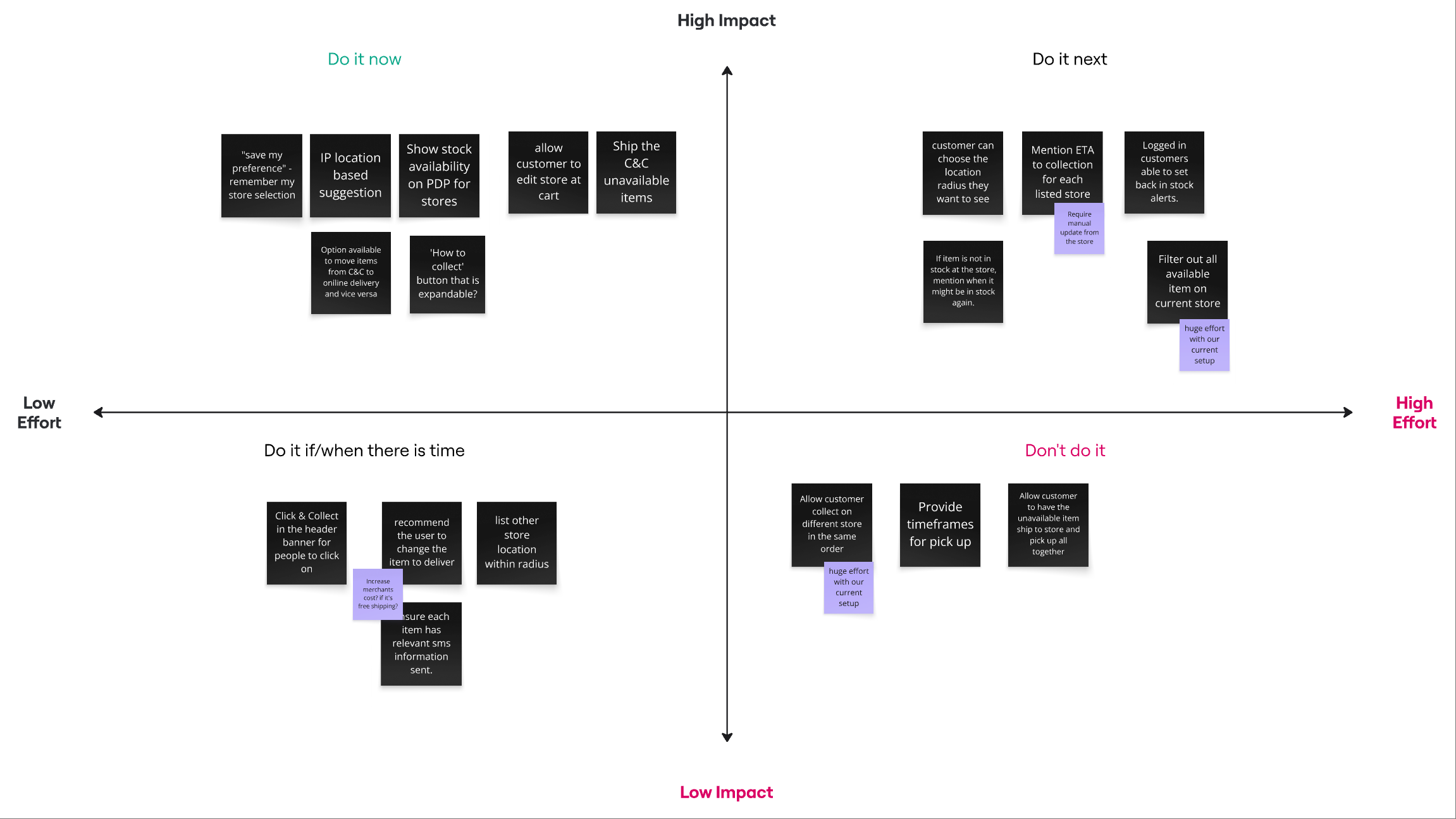
Painpoints VS DVF Lens
Painpoint 1
The whole order blocked at checkout when only 1 item out of stock.
Solution
Implementing split fulfilment.
• In-stock items would be reserved in-store.
• Out-of-stock items shipped to the customer.
• The free delivery threshold applied at the order level, balancing cost savings with customer satisfaction.
This was unconventional — most retailers kept Click & Collect and delivery separate — but it directly addressed our core challenge.
DVF Lens
Desirability
Customers needed confidence that their order has less frictions during Click & Collect
Viability
The business needed lower fulfilment costs.
Feasibility
Devs reminded us of backend complexity, which forced us to focus on MVP scope.
Solution
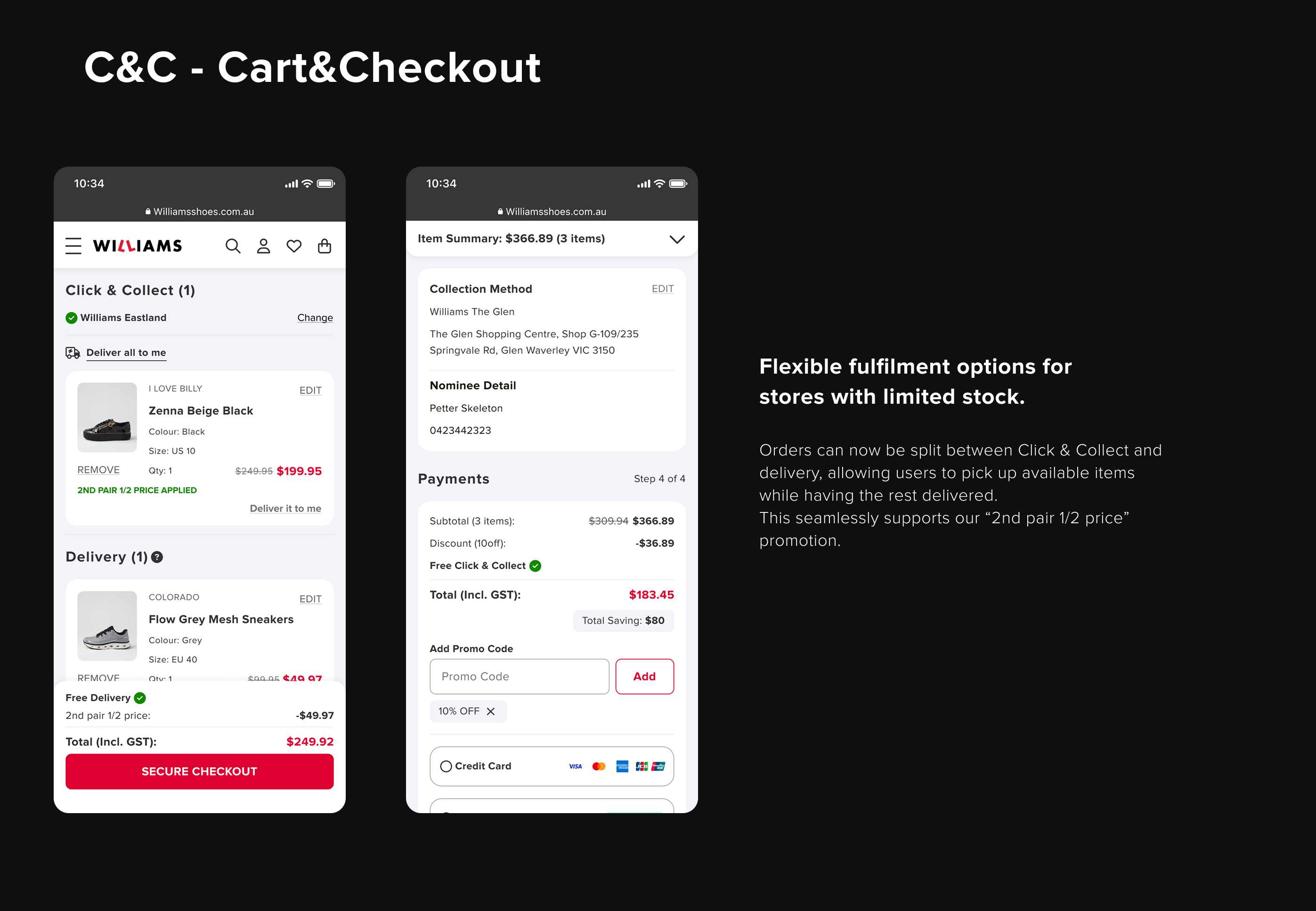
By adopting split fulfilment, in-store items were reserved for Click & Collect, while unavailable items were shipped directly to customers. Applying the free delivery threshold at the order level maintained a positive customer experience, while also reducing overall shipping costs, since costs were charged per item rather than per order.
Medium - High
This approach increased project complexity, as most retailers typically offer either Click & Collect or Delivery—not both in combination. It introduced multiple fulfilment scenarios to account for, making it critical to design the concept in a way that felt simple and intuitive for users, minimising confusion during checkout.
Painpoint 2
Nil pick (Fail to fulfil the order)
Solution
Email & SMS notify customer and provide $10 voucher for next order
Low
Most of the work involved backend development, as the system needed to generate a customised one-time voucher code triggered when a Click & Collect order was not fulfil.
Solution
Email & SMS notify customer and provide $10 voucher for next order
DVF Lens
Desirability
Customer need direct compensation to alleviate their frustration
Viability
The business needed gain customer retention on using Click & Collect
Feasibility
Customised one-time voucher code triggered when a Click & Collect
order was not fulfil - Low complexity
Painpoint 2
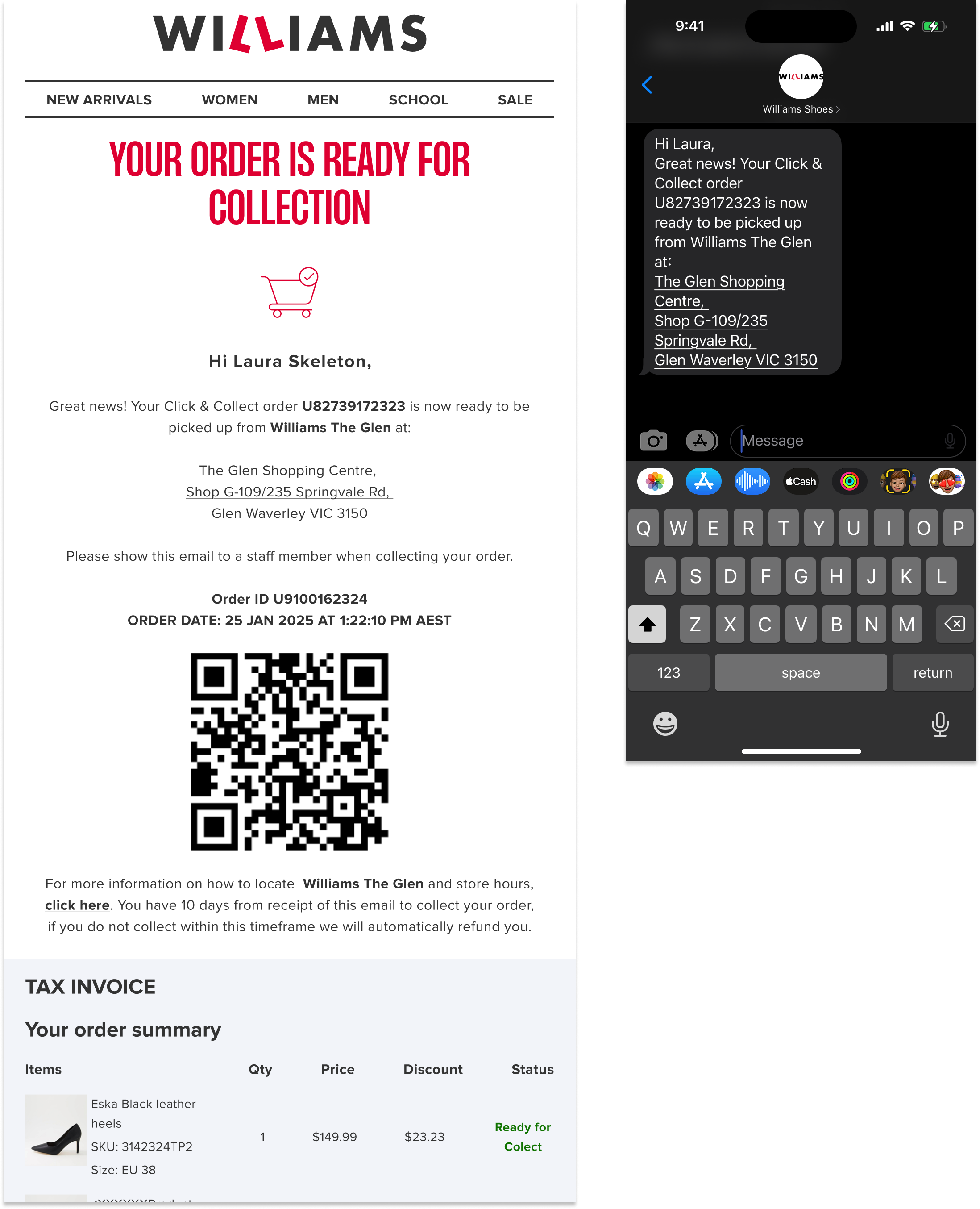
Not enough pick up instruction & timeframe information.
Solution
Email & SMS notify customer and provide $10 voucher for next order
Low
Most of the work involved backend development, as the system needed to generate a customised one-time voucher code triggered when a Click & Collect order was not fulfil.
Solution
Provide the information throughout the Click & Collect journey
DVF Lens
Desirability
Customers want certainty and clarity.
By surfacing timeframe and collection instructions at every step, we reduce anxiety and prevent unnecessary customer service calls.
Viability
Clearer instructions reduce operational friction (fewer support calls, fewer complaints).
Feasibility
Low complexity as mostly front-end works and the data already exsit
Painpoint 4
Users had to repeatedly select their preferred store for each order, creating duplicated actions.
Solution
Guest users: the preferred store is remembered only until the session expires.
Logged-in users: the preferred store is linked to the customer’s account for future orders.
Medium - Low
While most of the work involved backend logic, we needed to account for multiple scenarios to ensure the solution was both user-friendly and technically feasible.
Solution
Guest users → preferred store remembered until session ends.
Logged-in users → preferred store stored in their account for future orders.
DVF Lens
Desirability
Customers want a faster, frictionless checkout experience.
Remembering store preferences reduces duplicated actions and builds a sense of personalisation.
Viability
Reduces cart abandonment by removing unnecessary friction.
Feasibility
• For guest users: storing the store ID in the session is technically lightweight.
• For logged-in users: attaching the preferred store to their account requires modest backend work but integrates cleanly with existing account data.
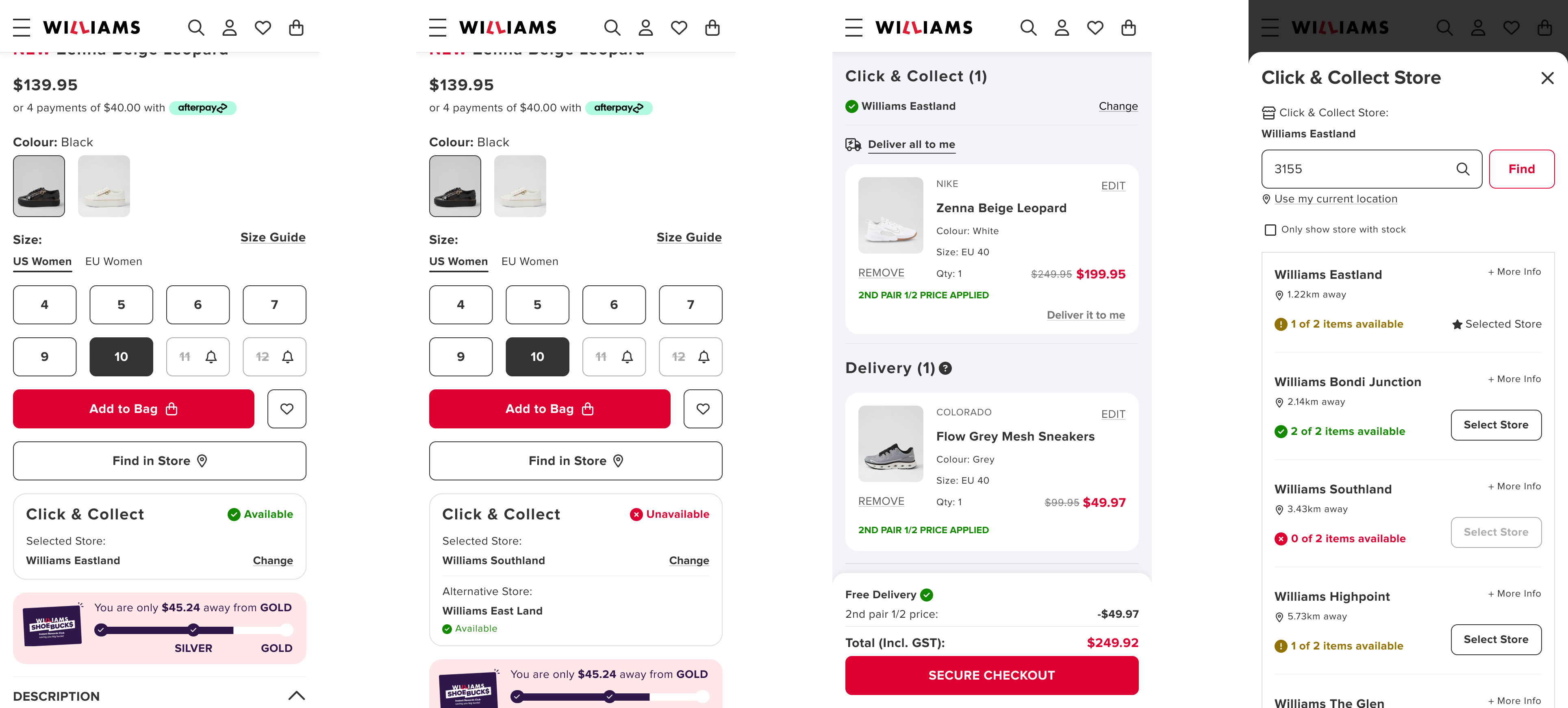
Concept Sketching
I translated these concepts into sketches and lo-fi wireframes, focusing on key touchpoints: product page, cart, checkout, and post-purchase comms.

Lo-Fi Design & Design Critique
Through multiple round of design critiques, I iterated quickly based on the feedback close aligned with our painpoints.

Hi-Fi Design & User Testing
Once aligned, I built high-fidelity Figma prototypes to test.
User Testing Objectives
Do customers understand split fulfilment?
Can they confidently change their preferred store?
Do they feel informed enough to complete purchase and collection?

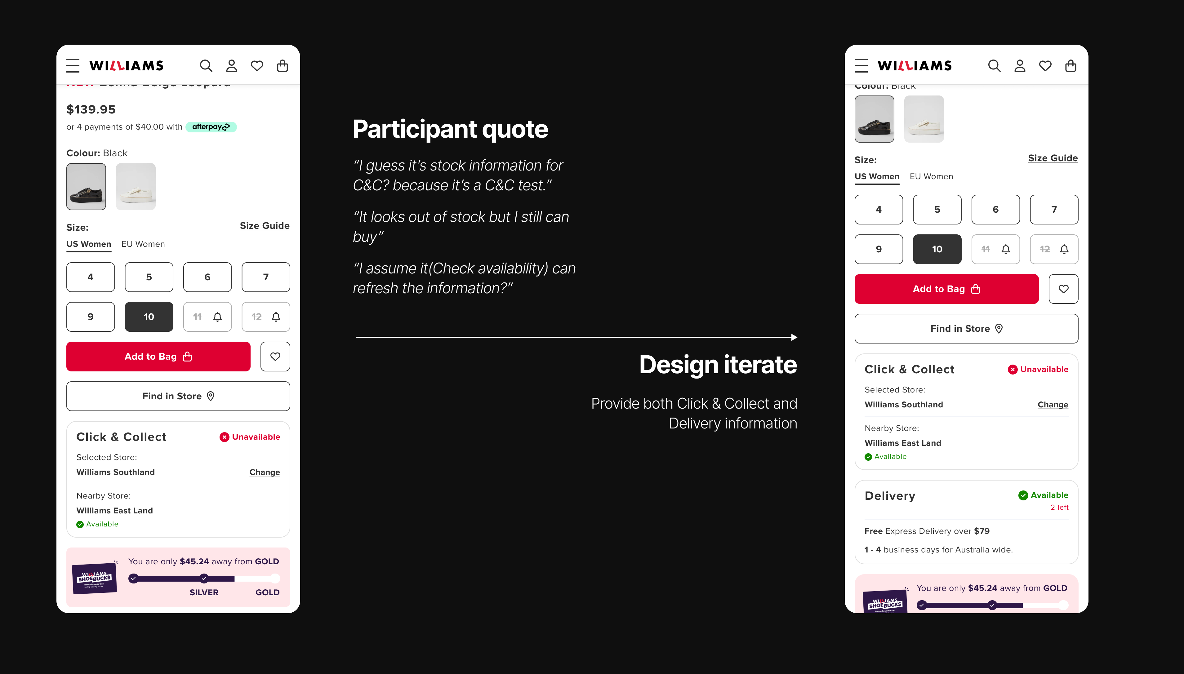
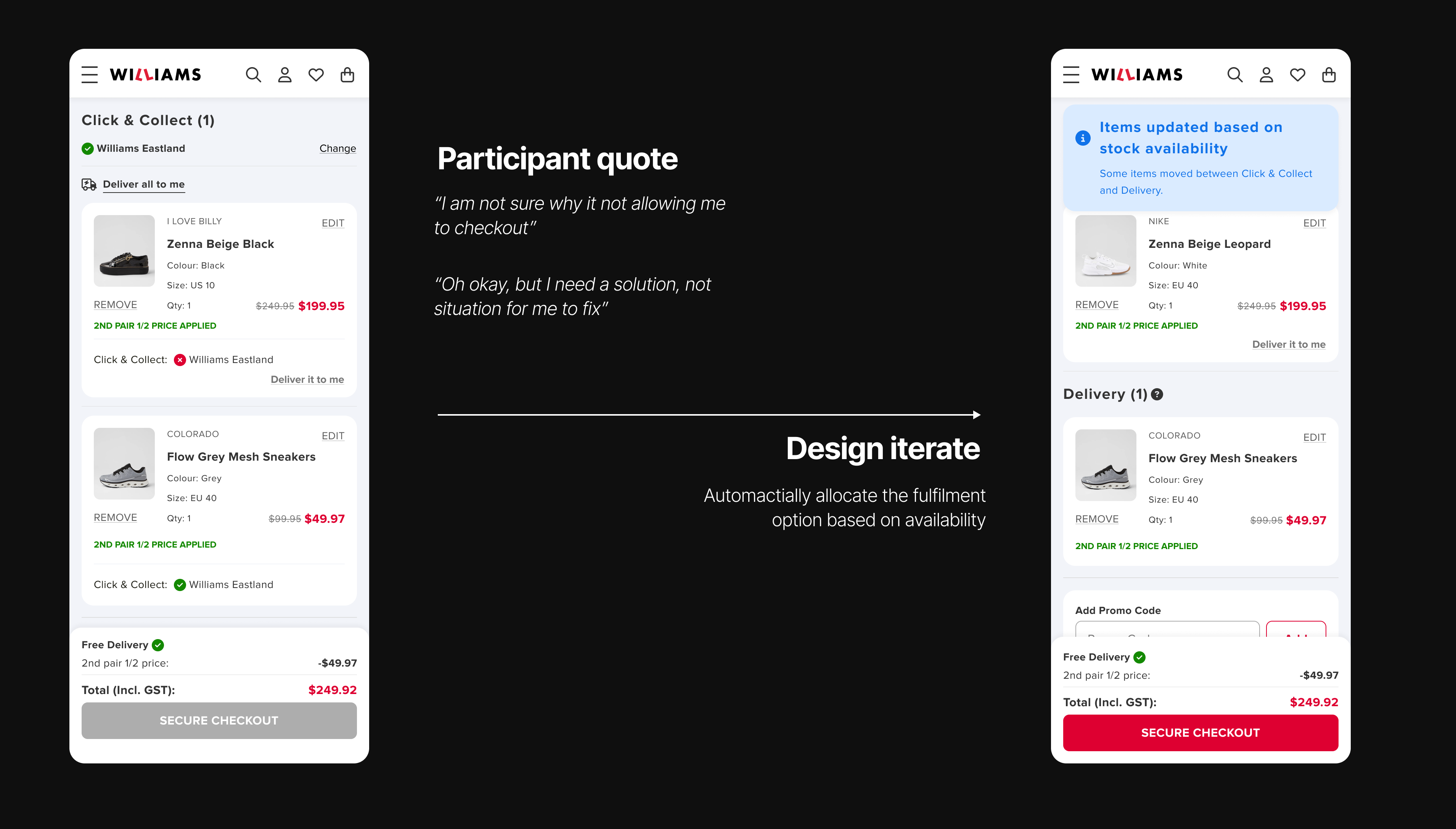
Testing results were encouraging:
• 5/5 participants grasped the split-fulfilment concept without much efforts.
Quote:"I like that I can still pick up and shipping together, it would be helpful if I am going to that area on that day"
• Confidence in order completion without much confusion.
• Some detail interactions and copy needs to refine.
Iterations
MVP

Design system contributions
I extended our multi-brand design system with 20+ reusable Click & Collect components and states to ensure consistency and speed.
Also here is a case study of how I create a multi-brand design system.
View Case Study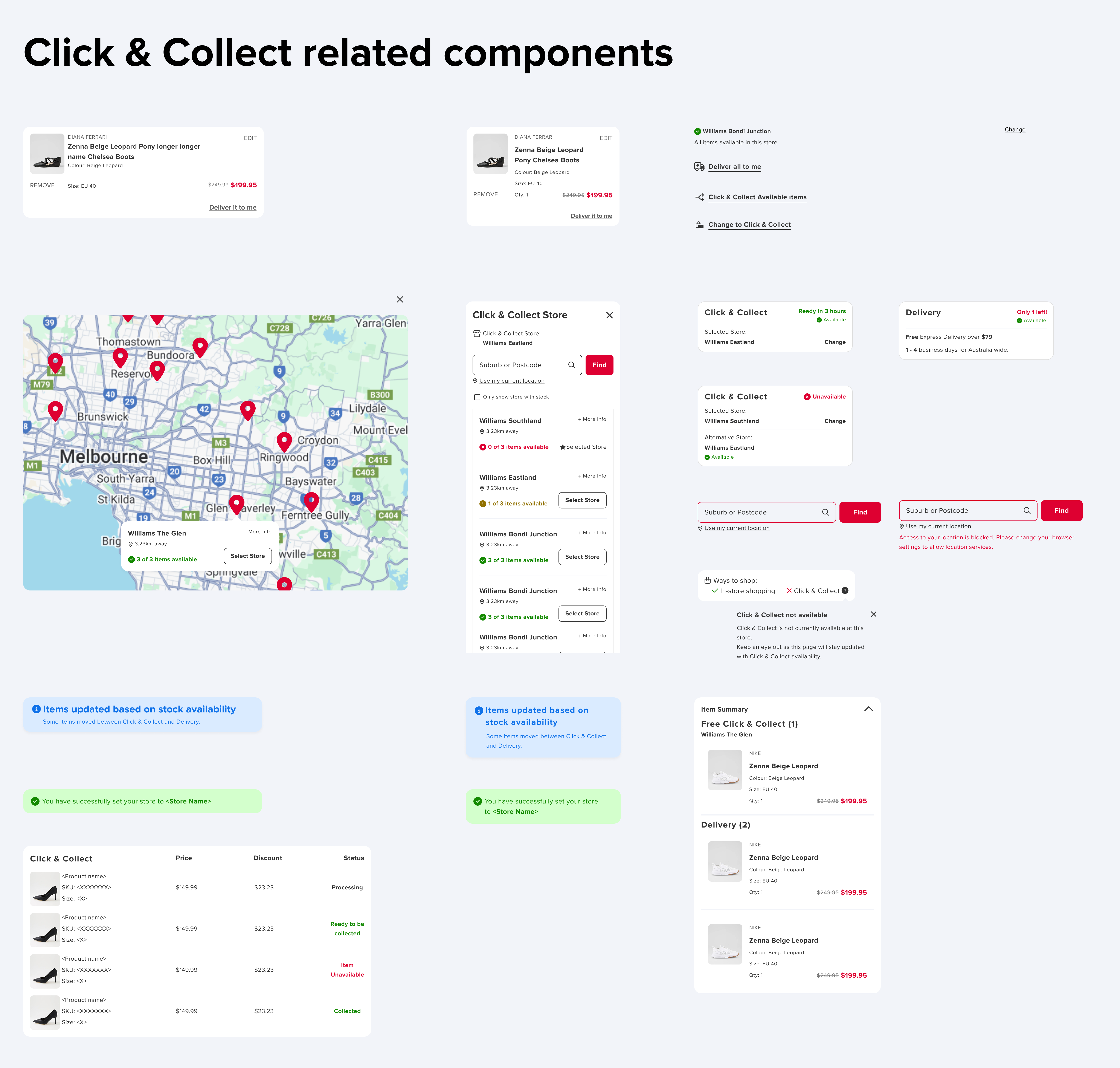
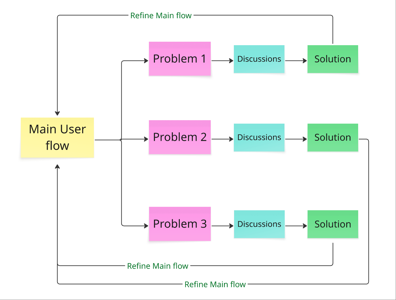
Breaking Unanswered Problems down into Small Problems
It’s good to create a detail user flow and list out all unanswered interaction question to prevent design change or scope creep on late stage.
After a user flow walkthrough session with FE, BE and QA, we discovered some unanswered question which might affect the user experience if we don’t address them.

Every unanswered question can be treated as a small problem which might required discussion and designs in a smaller group. The user flow will also get refined alongside when we solving those small problems.
Example Problem: Cart Merge - Guest customer to Logged-in customer
Merging a guest user’s cart upon login could change their preferred store, stock availability, and fulfilment options. Our challenge was to ensure this process was smooth and intuitive, so customers wouldn’t encounter confusion or disruption during checkout.
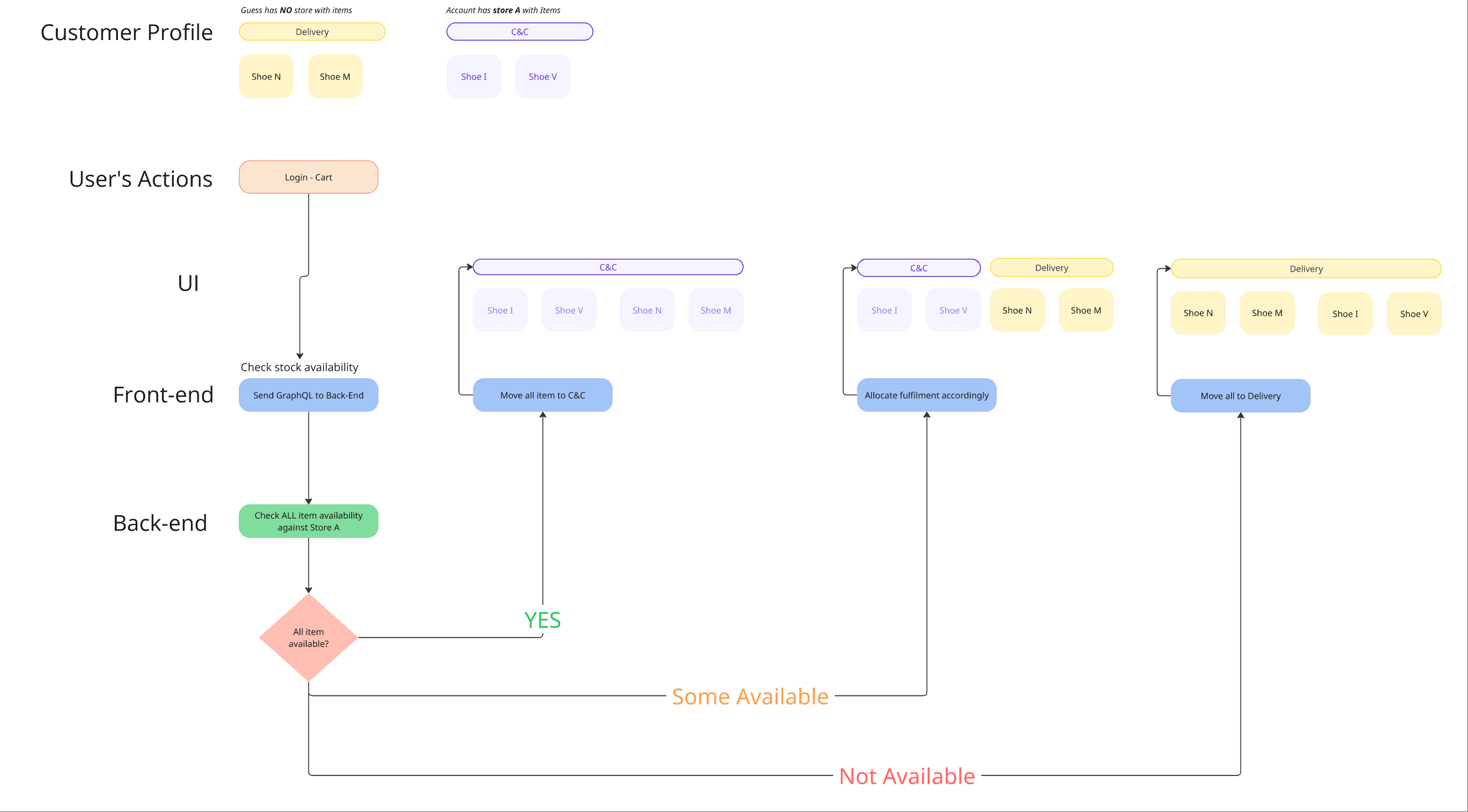
Solution
Back-end will merge all the items check the availability against the account preferred store, and allocate into different fulfilment method according to the stock availability.
Designing Beyond the Screen
I knew this wasn’t just a UI problem. So I tackled the service layer too:
Staff Process
Introduced a “Click & Collect ready area” in stores, so reserved items wouldn’t accidentally be sold to walk-ins.
Comms journey
Designed new email/SMS reminders and failure recovery messages (e.g., voucher if fulfilment failed).
Comms Design