The Problems
Williams' e-commerce conversion rate has been steadily declining due to poor and outdated user experience.
Customer support calls increasing, with users struggling to place or manage orders.
User scarification is low with complaints about the bad experience on our online store.


Project Goals
Streamline the Williams online store experience to boost conversion rates and reduce customer care inquiries, with the solution designed for rollout across other internal brands.
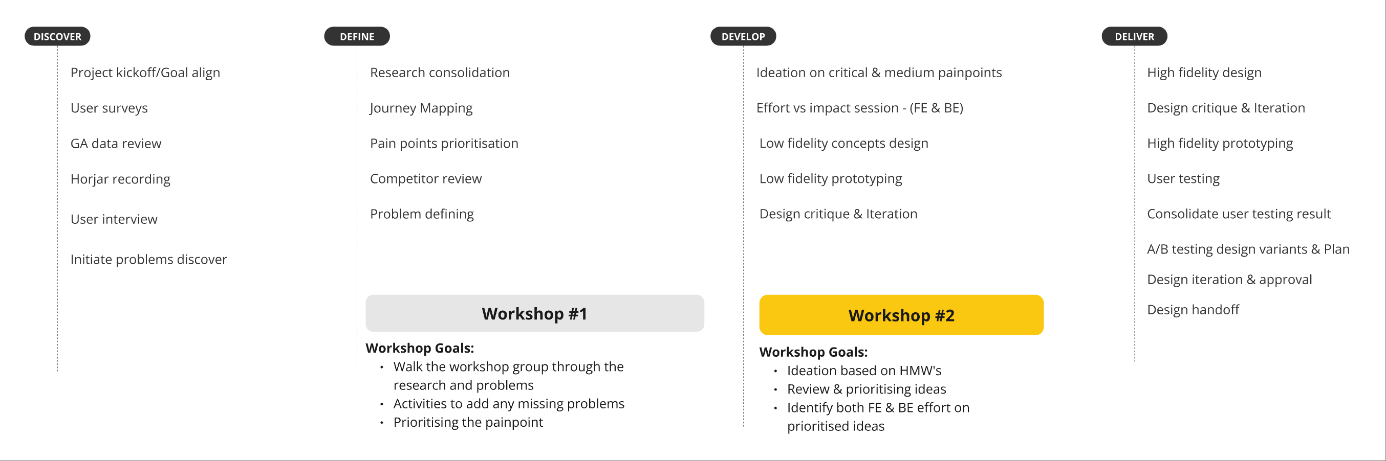
Design Approach
Technical limitation on A/B Testing plan
User Research
What do our users think of our current experience? - User Survey
Curious about our users' thoughts on our e-commerce experience, I set up a Hotjar survey on our site.

Early responses indicated key areas needing attention: Filters, Cart & Checkout, Account, and Find in Store.
How is our data of our e-commerce site?
More than 70% of our user coming from Mobile and mostly iPhone user
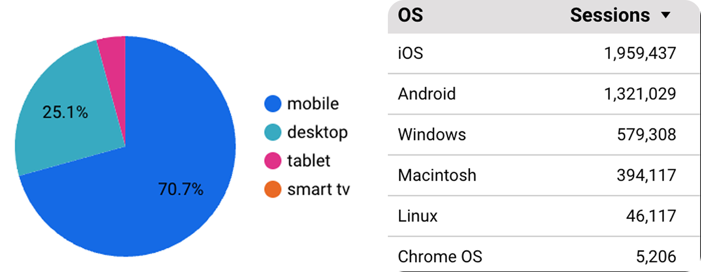

Nearly 90% user sorting from the lowest price, and they are more interested in changing colour, size & brands.
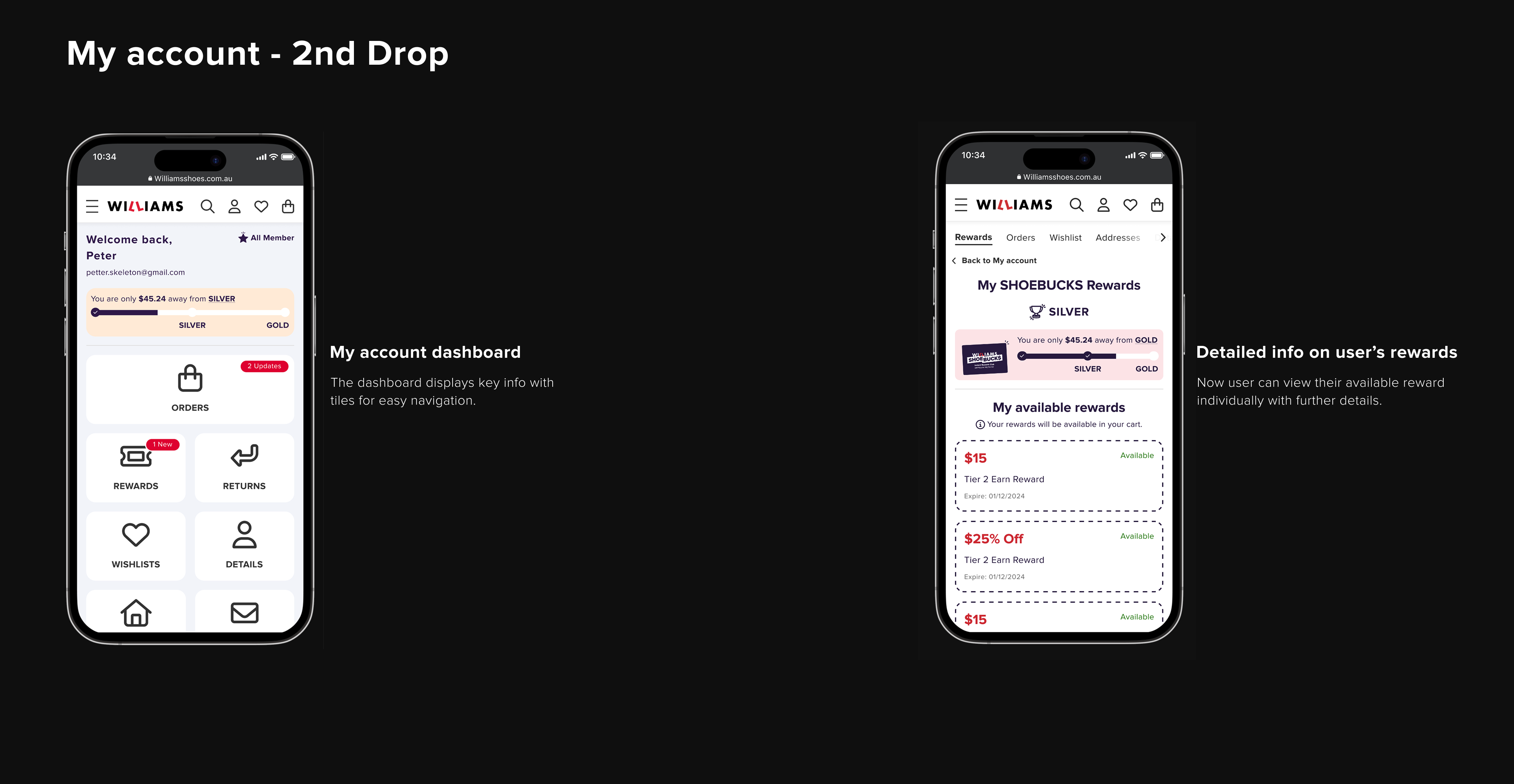
Most user would check on their order details and available rewards when they using My Account.

How our user interact our e-commerce exepirnce?
Observing how customers interact with our e-commerce site provided valuable insights. I reviewed Hotjar recordings of both desktop and mobile sessions, focusing on Cart & Checkout, Filters, and My Account—areas that received the most negative survey feedback.
From the recording.

Initial insights
1. User seems tap the wrong filter selection often.
2.User have to scroll all the way up each time to use filter.
3. User going back and forward between cart&checkout.
4. User seems spent sometime to locate their purchased items
What does our user says about our current sites?
For deeper insights, I partnered with the marketing team to recruit 10 existing customers for interviews, selecting participants based on our user persona, Laura.

During the interviews, we asked users about their shopping habits, decision-making process, and frustrations—both general and specific to our site. We also explored why they remained returning customers despite these issues. The responses aligned with our previous research but revealed some interesting findings:
1. Users can't edit product details once in checkout, and the shopping bag detail disappears.
2. They adjust filters when faced with ugly shoe options in the results.
3. Users struggle to track their shipments and often need to call for updates.
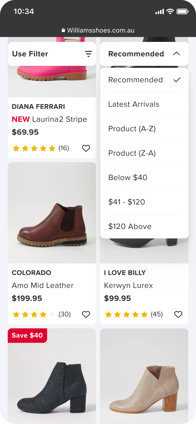
4. They want to see more products per screen with less scrolling.
5. Missing or forgot to put in their promo code, have to call customer care to cancel.
Defining
How does the current user journey looks like? and what can we do about it?
After gathering potential pain points and insights from the earlier research, I quickly mapped out the purchase flow and collaborated with the team to identify opportunities aligned with those findings.
It turned out the filter had long been a pain point, preventing users from finding products. Shipping status updates relied heavily on manual processing by customer care and email, which users often did not receive.

Identified PP vs Solution
Painpoint 1:
Users had to scroll back to the top each time they wanted to adjust the filter.

Critical
This likely impacts the conversion rate, as users want to adjust filters as soon as they see unwanted styles in the product list. Since the filter is only available at the top of the page, it is difficult to access, forcing users to scroll through items they are not interested in.
Solution
Filter and Sortby button become sticky when user scroll, only refresh the page when user applied a filter.
Low Effort
Mainly front-end and design works may contains multiple rounds of design reviews and usability testings.
Painpoint 2:
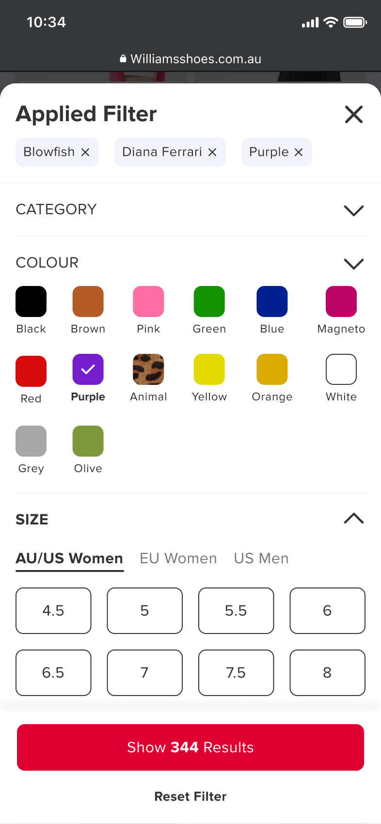
User only can apply 1 filter, and they need to scroll back to the filter to apply another one.

Critical
Each time a user clicks on a filter option, the page automatically scrolls down to the results. This forces them to scroll back up to adjust the filters again, creating friction in the shopping experience and potentially impacting
conversion rates.
Solution
A drawer shows when user activating the filter, and only show the result when user click on show result button.
Medium Effort
Primarily front-end and design work, with minor back-end changes: the front-end triggers a GraphQL call on each filter click, while the back-end returns only a Yes/No until ‘Show Results’ is clicked, when full product details are sent. This improves both user experience and performance.
Painpoint 3:
Dead end if user run out of filter, no further option on no result page.

Critical
Because users have significant freedom to adjust filters, there’s a high risk they’ll encounter a no-results page due to back-end inaccuracies. Leaving them to resolve this on their own can lead to frustration. "Continue Shopping" CTA only takes user back to home page which create more frustration.
Solution
When no results are found, users can review their applied filters, adjust or reset them, and scroll down to view their browsing history.
Low Effort
Primarily front-end and design work with couple round of design review and usability testing. reusing the components from the filter drawer.

Painpoint 4:
Users are unsure how to pick up in-store after finding their shoe in stock, as no further actions are available online.

Medium
While the impact on conversion may be limited since most products are available for shipping, GA data shows that in-store pickup is actually more popular than delivery.
Solution - Request from the Business
Providing Click & Collect functionality as we are falling behind on this service.
Very High Effort
This is a large project which require dedication of multiple cross-functional teams from online to offline.
View Case Study
Painpoint 5:
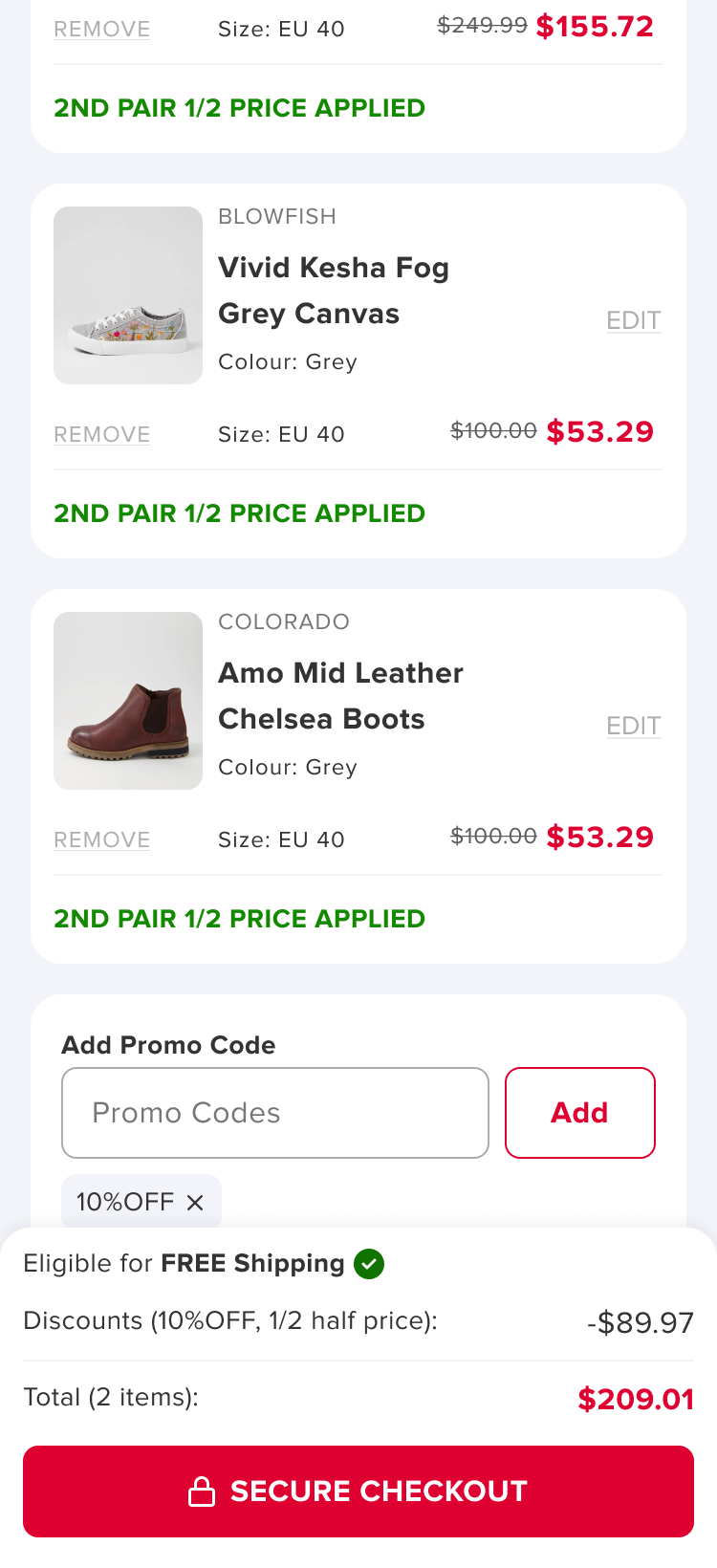
The promo code field is hidden on the cart page, making it easy for users to miss.
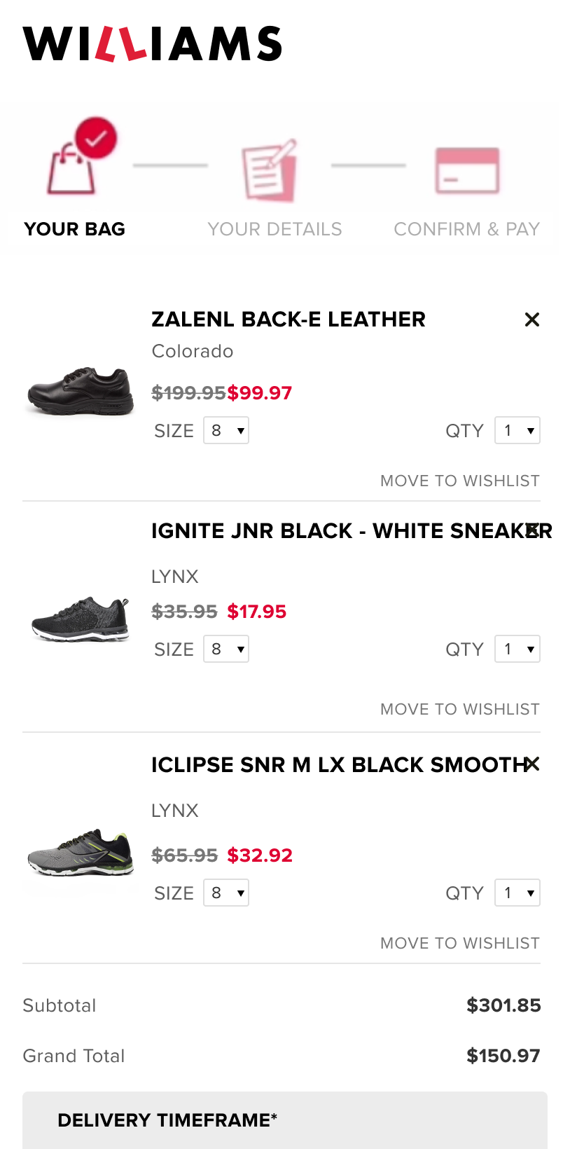
Medium
This can frustrate users if their order isn’t the best deal, and customer care cannot cancel it once it’s quickly sent to the warehouse. Some users may return the product and reorder, increasing costs for us due to the 30-day free return policy.
Solutions
1. UI improvement: Move the promo code input higher on the cart page and provide another entry field before payment.
2. Automation: Automatically apply promo codes when users are eligible.
Medium Effort
A minor front-end and UI update, but more back-end logic work, requiring extensive discussions to balance promo calculation rules with UX considerations.
Painpoint 6:
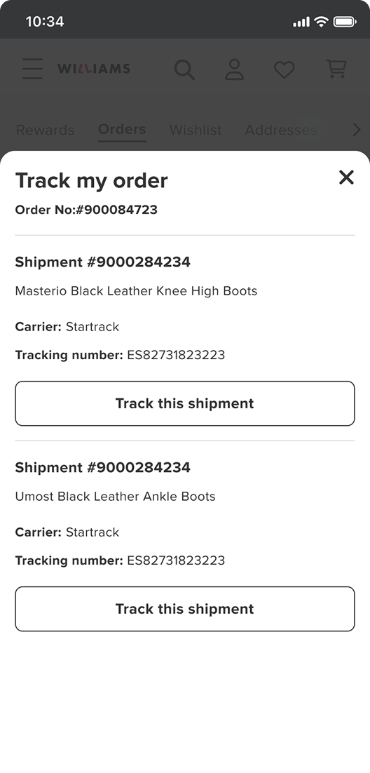
User often call customer care for the update of shipment or tracking number
Critical
Although tracking information is sent via email, some users never receive it—especially those with BigPond addresses—leading them to call customer care for shipment updates and adding unnecessary workload to the team.
Solutions
Integrate shipment tracking functionality with AUPOST in their order detail
Low Effort
Mainly front-end and UI design with a couple of unmoderated user testing sessions.